
Insights
Increasing conversions by improving your customer’s online experience
There are several important elements that make up a successful digital advertising campaign, all of which must work together in order for the campaign to succeed. Sometimes just one weak element can impede the success of your campaign, but identifying that element isn’t always easy.
Our client was looking to increase sign-ups for their high value service, and partnered with Suite 66 to run their programmatic campaign. Unfortunately, we found that while their ads were performing well, our client was not getting the sign-ups they desired.
We could see that people were dropping off as they moved through the sign up process. 45% of people who clicked the ad began the sign up process, but when it came time for them to enter their payment information 69% of the people who clicked the ad had abandoned the form.
Was the plan too expensive? Was their credit card not accepted? Did they forget the promo code shown in the ad, and go back to look for it?
We needed to figure out what was preventing these potential customers from following through.
Clicks aren’t everything
Getting lots of clicks is great, but a high CTR and low conversions can often indicate poor targeting tactics. We knew that we needed to use the right tactics in order to reach the right customers. We understood that switching service providers is a big decision that can require a bit of initial hassle. Even if the savings are great, the idea of making that switch can be daunting. Our strategy and targeting tactics allowed us to make sure we found qualified potential customers at a time when they would be most open to making a switch.
We started by serving potential customers ads that educated them on the features and benefits of our client’s offering. Once our audience was familiar with the service the team re-targeted those who went to the landing page but did not complete the sign-up form. People who clicked the first ad were later presented a second ad that outlined the benefits of switching services along with a promo code to further entice a switch.
We found that potential customers were starting to fill out the sign-up form, but were giving up before completing the switch. Their actions indicated that they were interested, but something in this process was stopping them from signing up and making the switch.
The importance of visual consistency
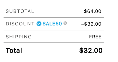
The re-targeting ads promoted a significant discount for switching to our client’s services. However, after the ad was clicked, there was no mention of the promotion on the landing page or throughout the sign-up process. The form only mentioned entering a promo code in the second last step — just before the user was required to enter their payment details. By this time they may have forgotten the code shown in the ad, and may abandon the page in order to look for it.
There are two problems here. One is that the messaging on the ad is not consistent with the messaging on the landing page. In order to foster trust and reduce confusion the messaging and design of the ad and landing page need to be as similar as possible.
The second is that while promo codes can be an effective way to win new customers, they can lose their power when customers leave your page to look for them. A study by Paypal and Comscore found that 45% of shoppers had abandoned multiple shopping carts in a three week period. 27% of the people who abandoned their purchase reported that they did so to look for a coupon or promotion.
 Changing the language from “Promo Code” to “Discount Code” or “Gift Code” has been shown to reduce cart abandonment, and reducing the prominence of the promo code helps reduce a potential customer’s FOMO.
Since our client’s goal was to increase conversions through the ads, we recommended they keep the promo code visible throughout the sign up process or apply the discount automatically to reduce shopping cart abandonment.
Using design to reduce customer stress
We know that changing service providers is rarely easy. By simplifying the sign up process and making it as stress free as possible, we hoped to alleviate some of the potential apprehension felt by potential customers. There are tons of articles out there detailing form design best practices, like Venture Harbour — Form Design Best Practices, UX Planet — Designing More Efficient Forms and UX Planet — 16 Tips that Will Improve Any Online Form. But what all of these best practices come down to is minimizing the mental effort needed to process and store information, known as the cognitive load .
Remove irrelevant elements using conditional logic
Don’t confuse people by offering services that may not be available to their home. Instead, we suggested asking for the person’s postal code before they selected their services, then showing them the services that are available to them. This is called conditional logic — providing only information that applies to them based on their response to the previous question.
This reduces the average length of your form, while also reducing form abandonment by not displaying questions that might be irrelevant or confusing.
Reducing form fields and using top aligned labels will help make forms less overwhelming for your customer
Reducing form fields from 11 to 4 increased overall conversions by 120%, with no impact on quality of the conversions. Removing unnecessary form fields like “office phone number” and combining fields like “First name” and “Last name” to “Full name” reduces the number of steps required to complete the form, and in turn reduces the user’s cognitive load.
Form fields can also be reduced by using tools like a zip code or postal code lookup which remove a person’s need to fill out their full address, saving time and reducing form fields.
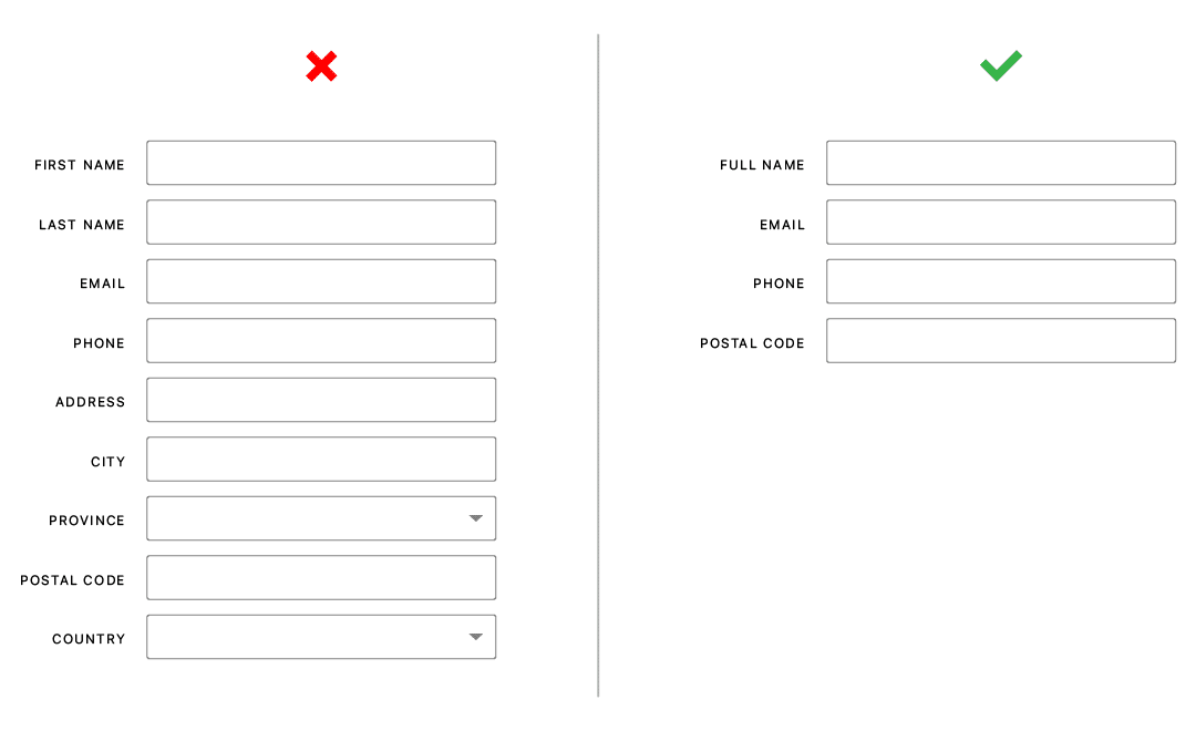
By asking for a full name and using a postal code lookup, you can reduce form fields from 9 to 4.
Another way to reduce form fields is to ask yourself “Can this item be asked of the customer at another stage in their journey?” For example, the option to choose paperless billing would be more appropriate in the payment segment of the form.
Another simple design change is to include the label within the input area, rather than have it sit above. A form with only 4 fields can look quite long with each label placed above it.
Build trust with transparency
A study done by IDC (International Data Corporation) found 50% of purchases are abandoned because people want to make informed decisions but they not being provided enough information. The more money the product costs, the more information a person will want. Giving enough information throughout the sign up process can help prevent a person from leaving in search of answers.
Assuring people that they can switch their plan or cancel at any time eases them through the payment process.
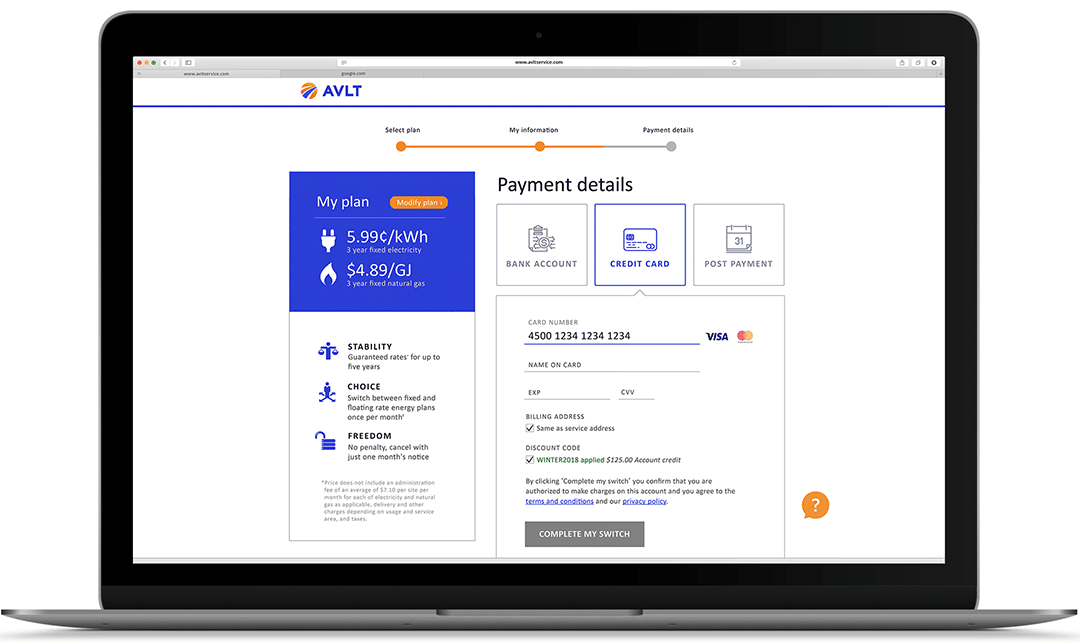
When it comes to a multi-step form, it is crucial to show people the total number of steps in the form, where they are in the process. Letting potential customers know exactly how many steps they have already completed makes them feel accomplished, and showing how many are left gives them a goal to work towards. It also lets users know that they won’t be clicking “Next” forever.
Transparency in the billing process is a must when asking people to purchase a high-value service. We recommended that the page that asks for payment information also indicate when service will start, and when the user’s account will be charged.
A behavioral economics study by the University of Chicago found that people are more likely to commit to service where they will be charged in the future, rather than right away. By letting the user know that they won’t be charged until a later date, we have given them more incentive to complete the form.
It’s all in the details
At first glance, lots of ad clicks but few sales may seem to be a result of poor targeting. By digging deeper and understanding all the ways users interacted with their brand, we found solutions to help our client reach their goal.
ILANA GOTZ
Designer
Contact us
Interested in learning more?
Insights

Case Study: Driving foot traffic to a local business
Watch what the owners of Lovely Pao had to say about the impact blogTO’s coverage had on this hidden gem.

How can creative affect the success of a campaign?
When it comes to display ads, advertisers have about a second to grab audiences’ attention. In that second, the viewer needs to be able to identify the brand as well as the offering…

Case Study: Reaching a national audience through local voices with Swoop
Swoop was looking to connect with budget conscious consumers to generate awareness and excitement around their ultra-low cost flights from four major Canadian markets.